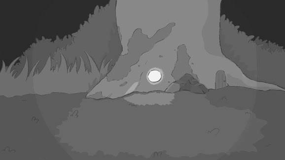
So originally I had a great idea of how to draw out the layouts
I was personally really, really pleased with the way it came out. But I noticed I had issues replicating this in a timely manner. And it didn't look as great for up close objects. So I shifted from a style like this:
To something like this:
And It made things a lot less muddier and easier to see overall without being too distracting. I did have to lighten a lot of stuff, too, as I noticed it was just getting too dark.
I will keep the opening layout shot, though. As again, I really liked it, and shouldn't be too much of a shift.
I will keep the opening layout shot, though. As again, I really liked it, and shouldn't be too much of a shift.
So just a nice little easter egg of what might have been


Comments
Post a Comment